Clever Cost
My role & Responsibilities
UI Designer – Interaction Design, Visual Identity, Design System
Team
René Hansen – UX Designer
Zsolt Laszlo (me) – UI Designer
Project length
6 months
Overview
Clever Cost is an expense management tool that simplifies cost tracking, empowers users with real-time insights, and optimizes financial decisions. With a user-friendly interface and smart algorithms, it streamlines expense management for businesses of all sizes.
While I worked for Clever Cost, I teamed up with an amazing UX designer. My responsibilities included crafting the UI based on the wireframes, and developing a dashboard that effectively presents diverse and complex data points in a manner that is easy to scan and comprehend.
My goals for this project
Due to the short timespan of the project, the UX designer and I had to work simultaneously. It was essential to keep a clean workfile and provide as much flexibility in the design as possible, so we could iterate on ideas quickly.
From the start of the project, I approached the design system process systematically to make sure that we would have a smooth workflow down the line.
I prioritised user experience over the look and feel. Clever Cost is a productivity tool, so I made sure to not overwhelm the user with unnecessary design elements and keep the dashboard simple and easy to scan.
Let’s get started
Structure and functionality
As this was a team project and my fantastic UX-er had already done all necessary foundations, I could get my hands dirty with the creative work! 🎨 My UX-er pitched the concept and received the initial wireframes, so I could get started.
Taking the first steps
Visual research
After reviewing the wireframes, it became evident that the dashboard needs to include substantial amounts of data in the forms of lists and graphs. To gain inspiration and insights on visualizing comparable data sets, I conducted thorough research.
Laying down the foundations
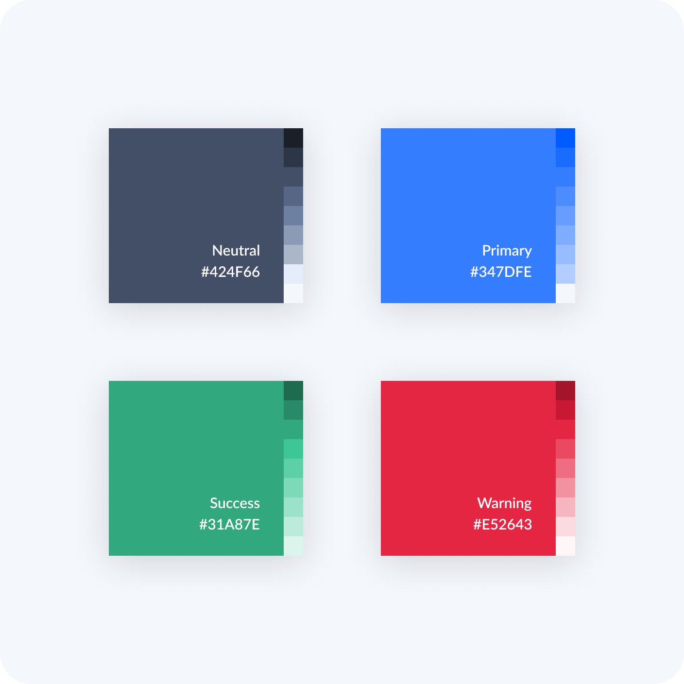
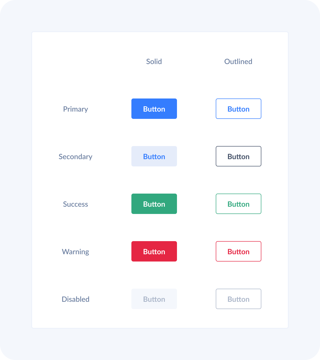
Design system
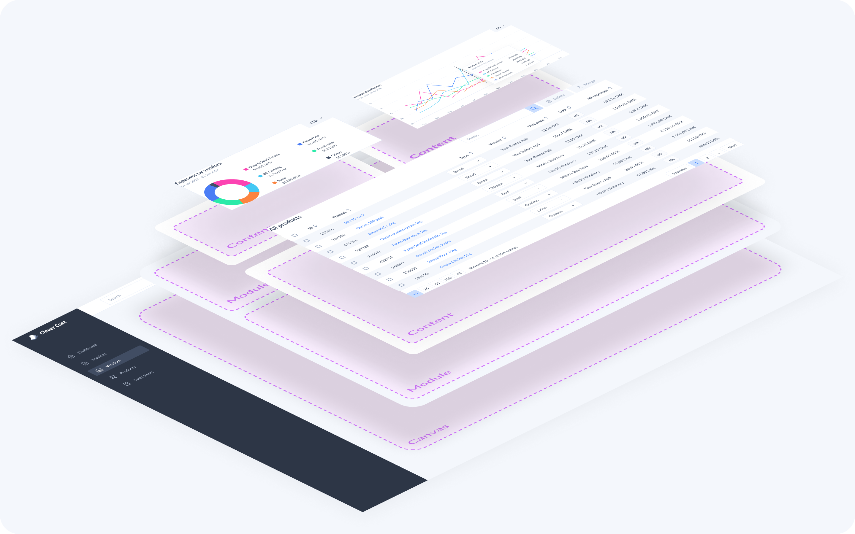
Due to the sheer size of the product, a classic atomic design approach seemed the most sensible. Based on the wireframes and the upcoming features planned on the roadmap, we already knew the product will have repeating components, nested in repeating components, nested in repeating components, nested in repea… You get it! 😄
This meant that I planned out how to build up the library, and made sure that the components provide flexibility and they are easy to use.

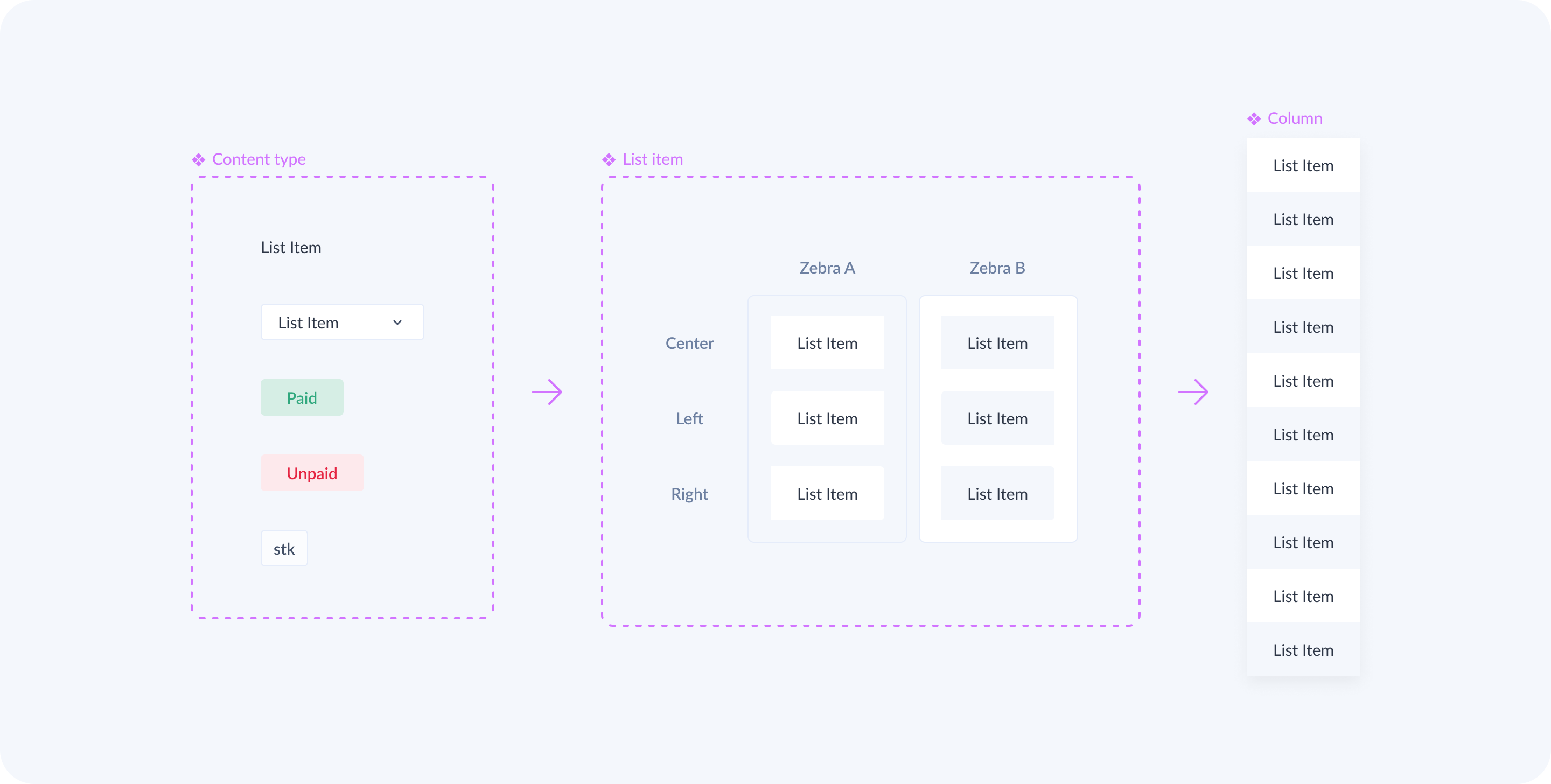
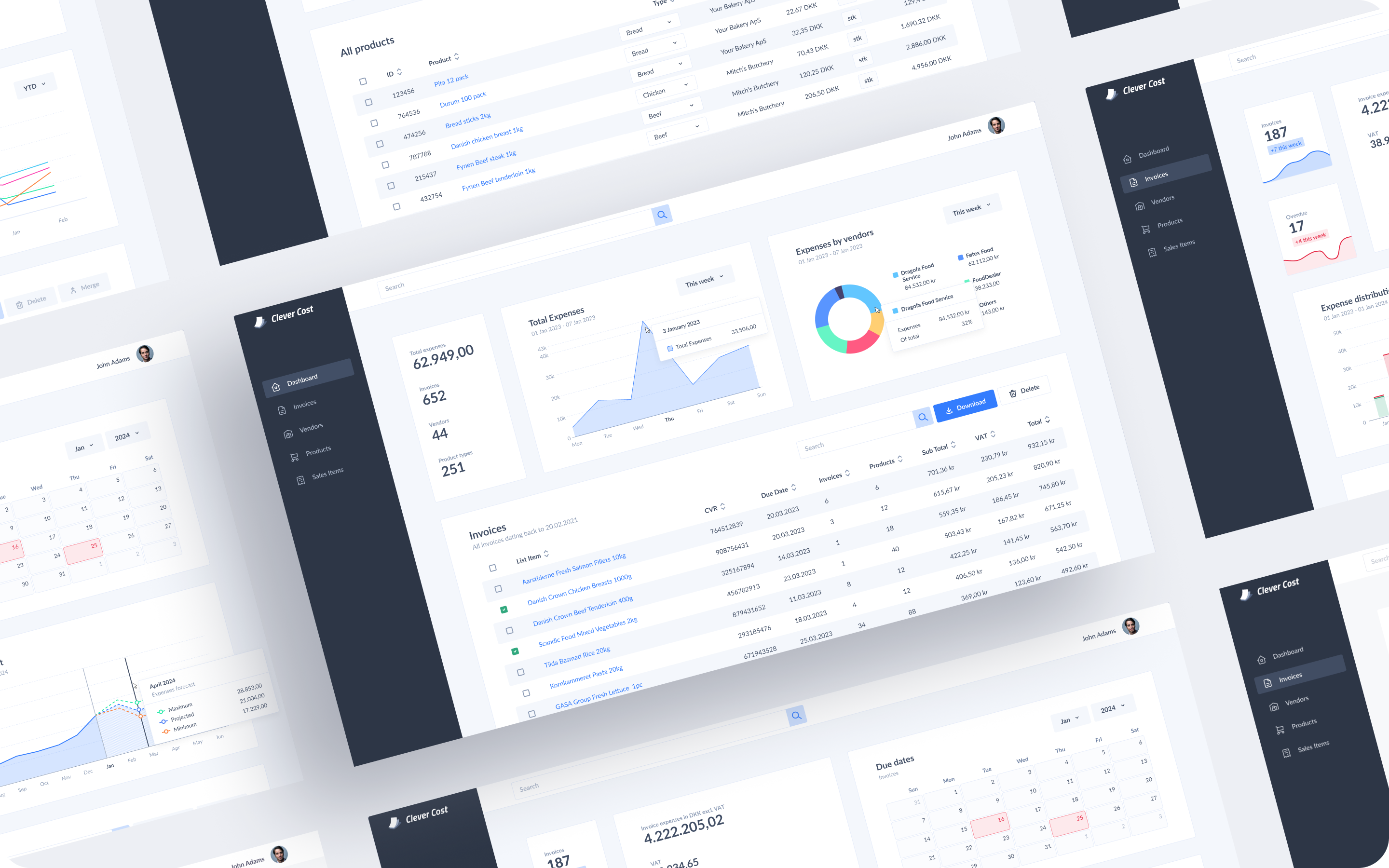
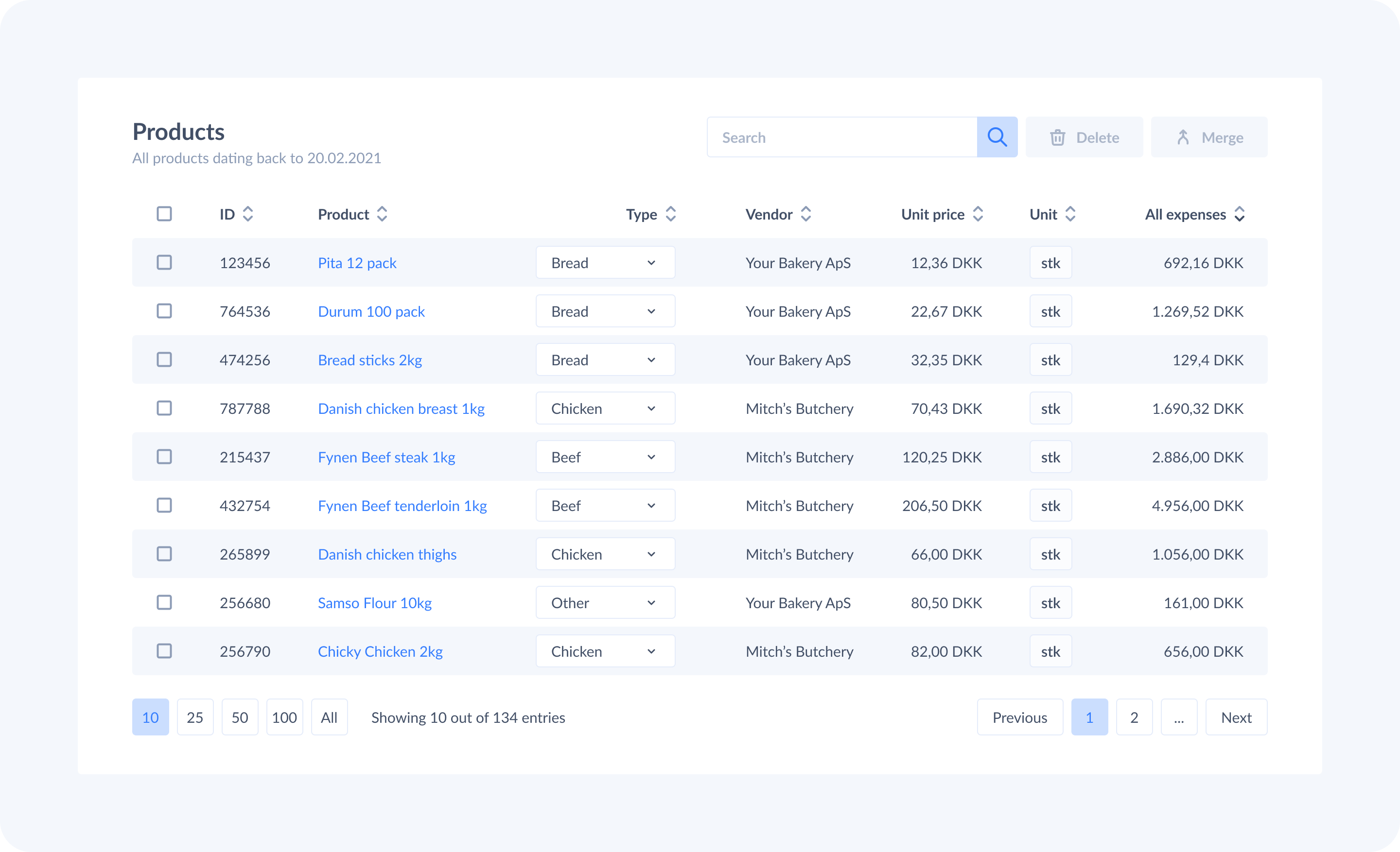
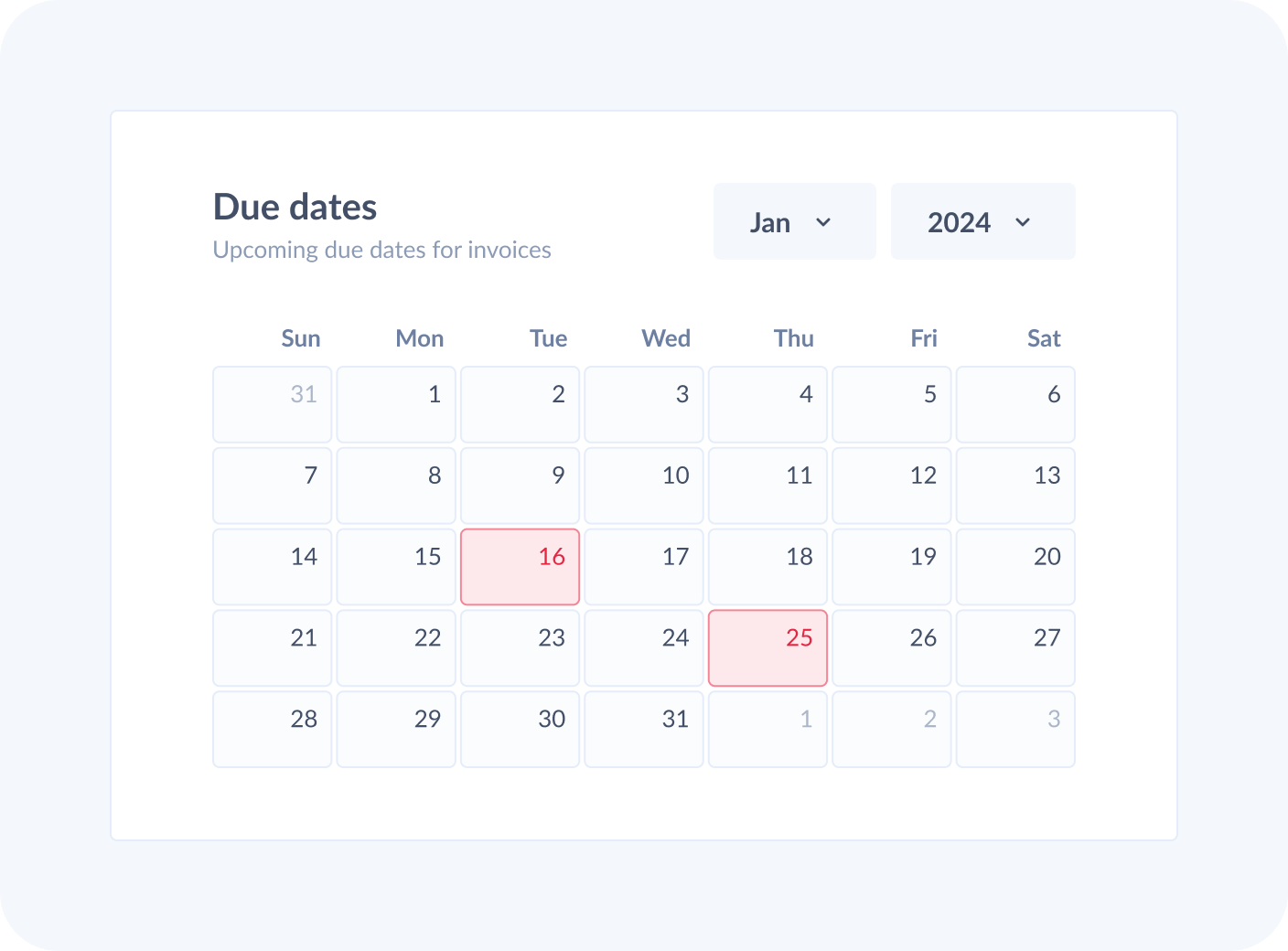
The processed invoices
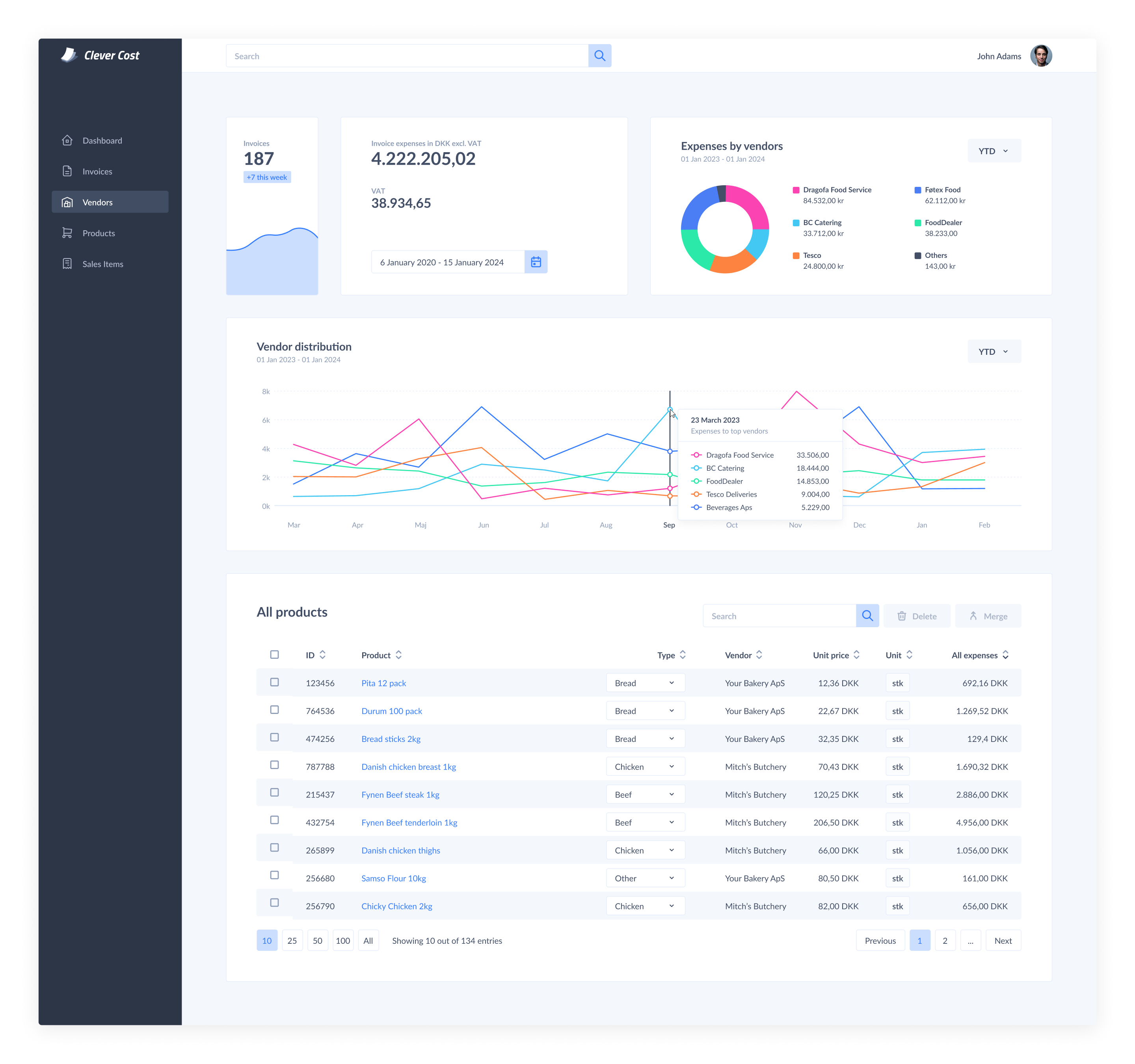
Once an invoice is processed, it gets added to a list, providing users with the chance for thorough verification. This list is designed to adapt to various configurations. The use of zebra stripes for rows helps in guiding the user’s eye without introducing unnecessary clutter, ensuring a streamlined and user-friendly experience. Additionally, there are bulk actions to aid the user.
So much data, so many options!
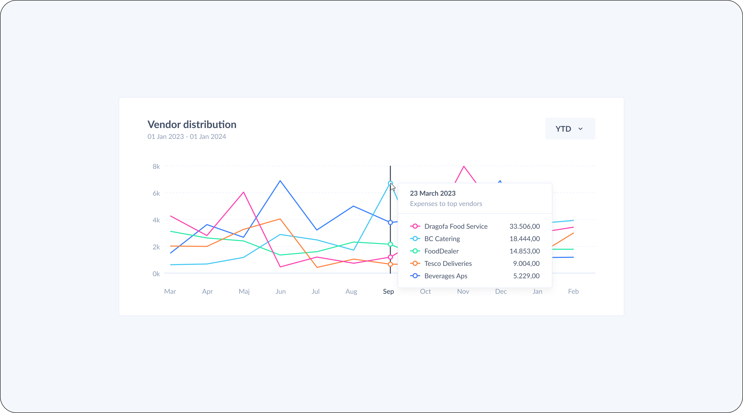
Graphs, charts and others
My aim was to transform complex data into intuitive visuals. We created graphs that automatically populate with real-time data harvested from invoices, simplifying the tracking process and providing valuable insights for informed decisions.


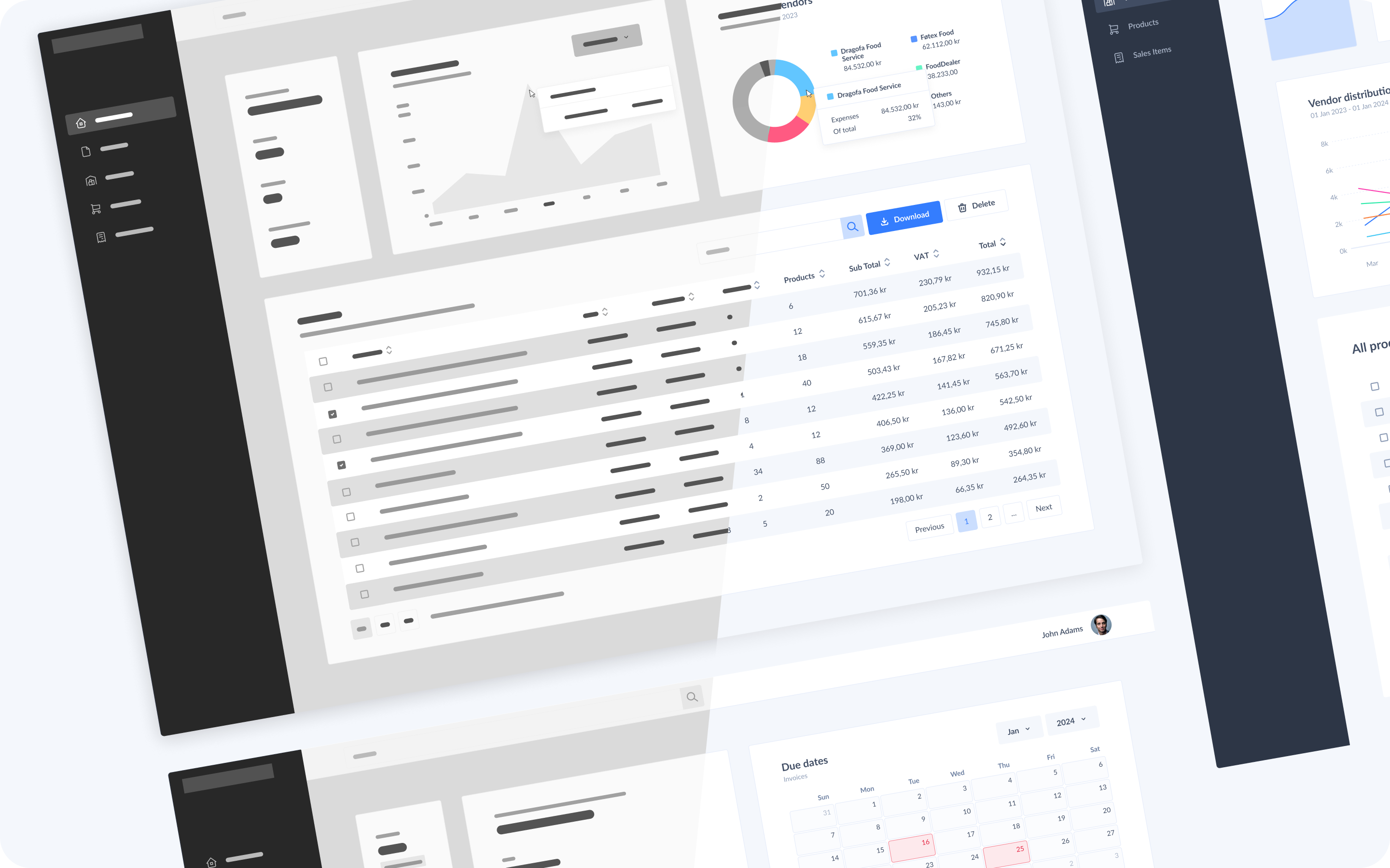
Creating the canvas for our artwork
I created every graph and indicator box to be flexible and interchangeable with every other element on the screen. No matter how much data they have or how much you stretch them, they should work within confines of the canvas. This helps the elements adapt to various screen sizes.
Let’s see an example
Closign thoughts
The project was initially launched in an alpha version, involving a select group of local businesses for testing purposes. This phase allowed us to identify and address unforeseen issues. Since its debut, the product has been actively on the market, undergoing continuous enhancements and refinements on a regular basis.