Esport App
My role & Responsibilities
Product Designer – Visual Identity, Design System, User Flows, Rapid Prototyping
Project length
2 months
Overview
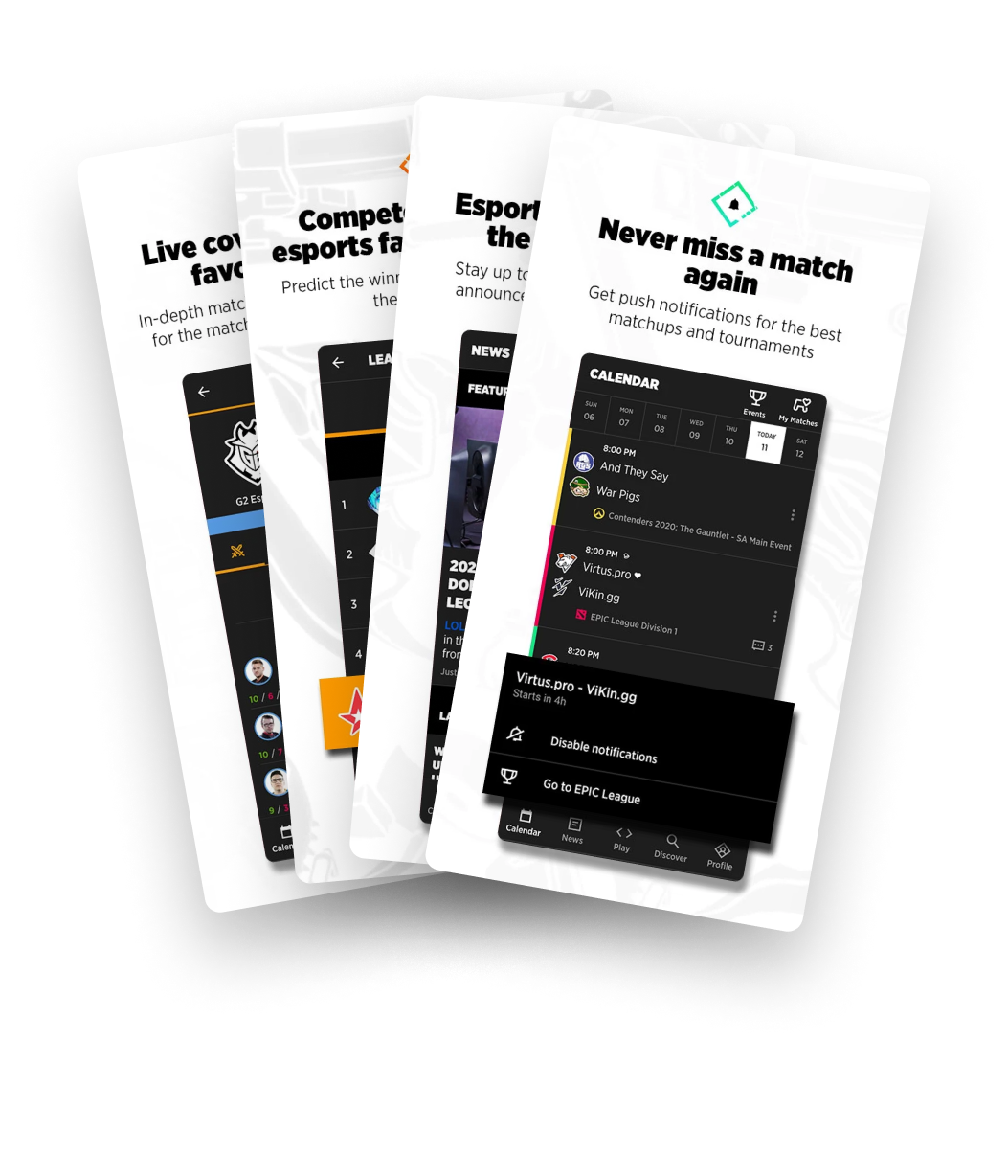
Live score apps for sports are widely popular, allowing users to check scores and news and follow their favourite teams. In the last 15 years, esports have gained a significant audience, leading to a demand for live score apps dedicated to esports.
When I started this project, I was already part of designing and developing several sport applications including football, basketball, cricket, and more. Esport was something that I was extremely familiar with as a fellow gamer myself. 👾

Project scope
The main goal with this project was to create a stunning and top-notch product concept to acquire investors, focusing on the popular game League of Legends for the demo. The app and design system were developed with the flexibility to accommodate various other games in the future.
So, who are we up against? ⚔️
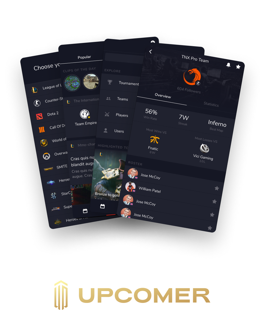
We are aiming to capture the imagination of the European and US markets. I started by analyzing the most popular esport apps and what they have to offer: Upcomer (discontinued) and Strafe.
Setting goals and laying down the foundation
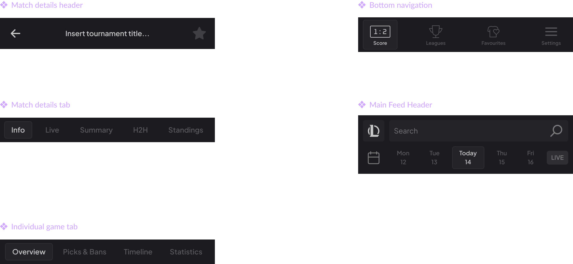
Keeping it simple
The simple structure below was inspired by other sport apps that I have worked with, as internal data showed that this information architecture works and users find it easy to navigate.
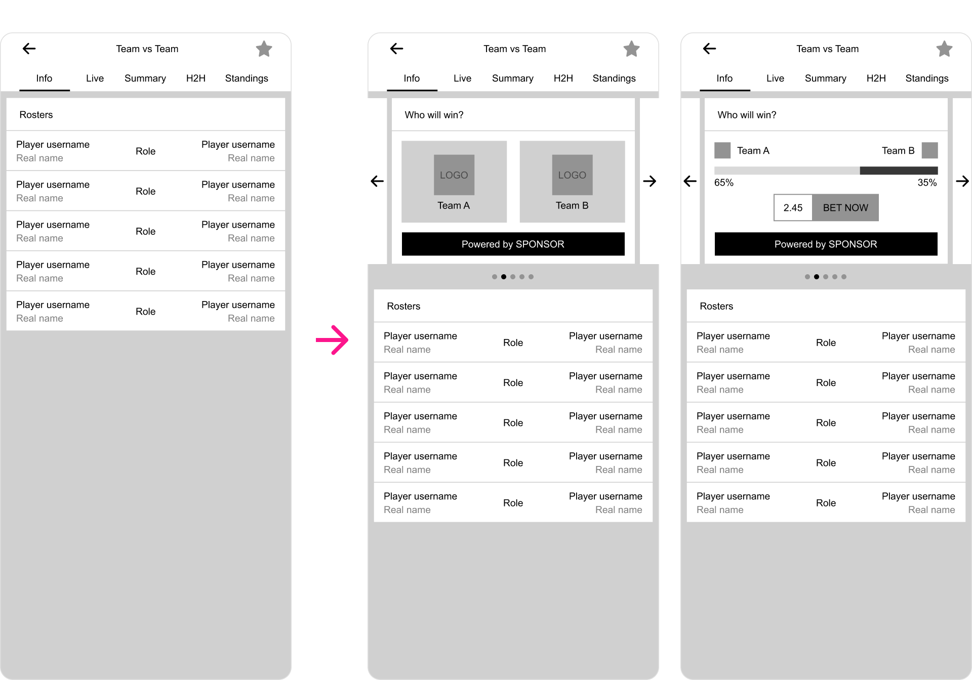
The main goal was to keep the main feed simple but still provide all the necessary information regarding the match statuses. From this screen, the user can deep dive into match details.
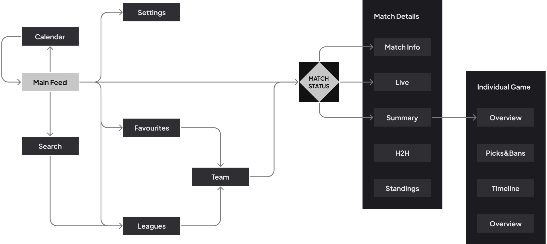
Low fidelity wireframes
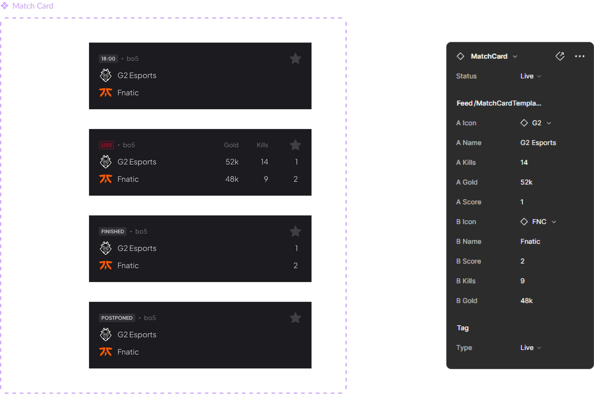
To align with the stakeholders from the beginning, I focused on the main areas within the wireframe flows. These included the main feed, match detail screens and individual game screens. I ran into some issues immediately on the main feed – it is arguably the most important part of any sport app, so I had to get it right. I came up with 3 different versions, which I tested in-house.

- Condense yet easy to scan through. Pretty much the gold standard structure in popular sport apps. While there are a lot of positives, due to the lack of space it does not allow special indicators without adding additional perceived clutter.
- It is a similar structure to option “A”, but there is a lot more space on the match card itself. The only drawback is that it is fairly large, so the user will see only a few match cards at the same time which could damage the user’s ability to scan easily.
- Aligning everything to the center would certainly give me a lot of options to make it look fresh and modern. Comparing teams on the same row has its benefits, but it’s troublesome to add additional indicators without generating a lot of negative space.
Conclusion
The in-house testing showed that option “B” is the best because we have fewer games on the same date, giving us more space. This means we can have bigger match cards and use special indicators without making the feed too crowded. We also don’t know which game will become popular in the future, so it’s important to have space for new ways to show a game’s status.
A shift in the direction
After I pitched the structure to my stakeholders, we had a workshop about the different ways of monetizing the app. Originally, we wanted to be an ad revenue based solution, which would require keeping users on the app for a long time to increase the revenue. However, the wireframes sparked the idea for an affiliate model for bookmakers (betting companies). This would require funnelling the users to a betting widget. In this scenario, we would need to have a few minor additions like the previously mentioned betting widget and additional stats/graphs that could help the used make educated decisions on their bets.
Finally, it’s time to get creative! 😀
Typography
I knew we will need a font with clear readablity and clear and visible variety when it comes to its weight. Due to the possibility of smaller devices and tiny indicators with text, it was important to have the number “1” with a wide foot and the lower case “a” with a bowl, so it does not get mixed up with an “o”.

Let’s talk colors
When it comes to the color palette itself, I didn’t need too many of them. Even though I would likely use a handful of shades, I wanted to have everything set in stone in case I had to reassign some of the dynamic color tokens to different primitive color tokens. I marked the ones in use with a tick, just so you get the idea. 😀

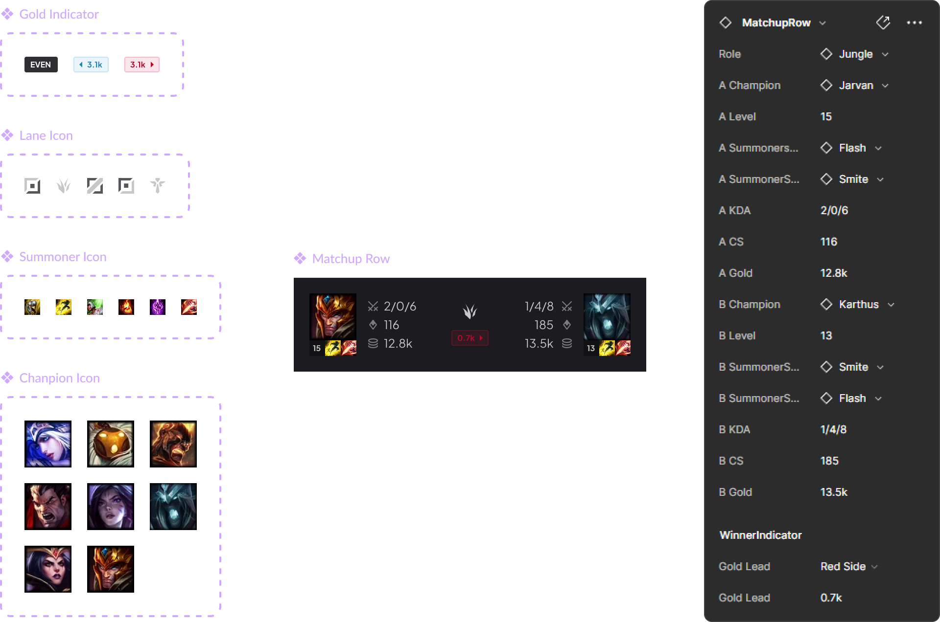
Iconography
A mixture of premade icon set used as the system icons and a set of custom icons made by me in the same style to showcase information just by a glance
Let’s talk about the design system

My approach
It was important to organize components and screens in a way that supports easy expansion and maintenance of the design file, ensuring the creation of a cohesive visual identity. The Atomic design approach is widely recognized as the gold standard for this purpose. Fortunately, modern tools like Figma simplify and scale this process. Considering the future need for the app to support additional games, I built the design system from the beginning to support rapid expansion.
Bigger & bigger building blocks
Using the atoms and molecules I could finally make more and more complex components. It’s important to make them flexible in case we need to convert everything to tablet resolution via the local variable tables.
Potential issues
It is important when we create such components that we do not overcomplicate things. The component editor is exrtremely useful feature, but in a team environment it has to be used other designers or copywriters, so simplicity and clarity is key
Screens… ASSEMBLE!
Supporting materials
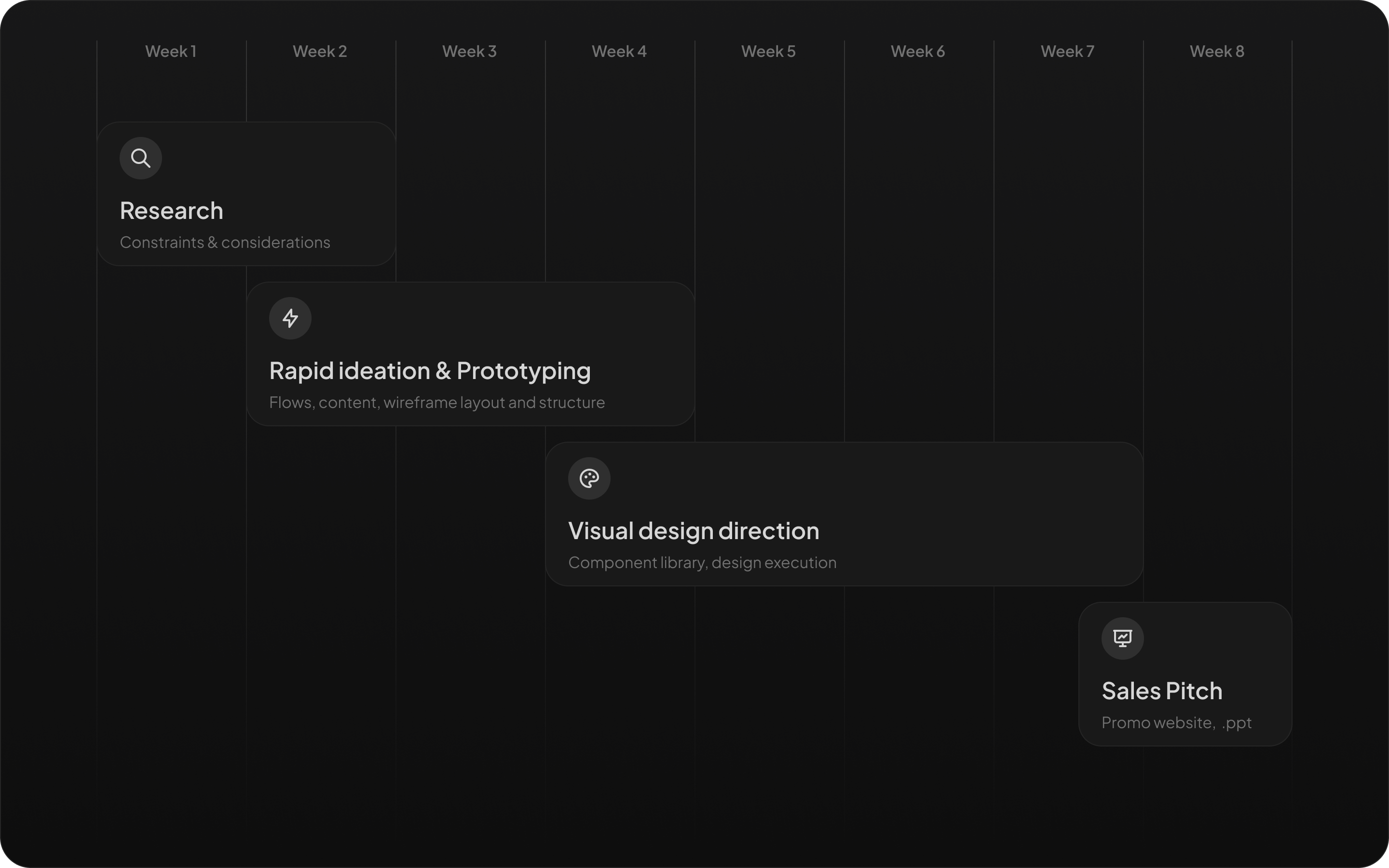
By having all the building blocks and rules set, it was fairly straightforward to make all other materials needed to establish an online presence. Everything from promotional websites to social media materials could be created in a rapid fashion. The aim was to create a trendy and appealing visual design that resonates with gamers. By incorporating elements that align with current gaming trends and preferences, the goal is to engage and captivate the esports community.
What are my takeaways?
Design system journey
This project served as an excellent learning opportunity to develop a scalable design system. This scalability not only saved time and effort but also helped in maintaining a user-friendly and harmonious interface across different stages of the app’s development.
Stakeholder management
Successful design goes beyond aesthetics; it involves aligning decisions with business goals. Collaborating with stakeholders allowed for common ground, ensuring that design choices not only elevated user experience but also aligned with the business strategies regarding monetization.